August 9, 2019
Chanel's logo is one of the most recognizable worldwide, and a standard-bearer for clean design. Image credit: Chanel
By Katie Lundin
Once upon a time, it did not matter if a local business accidentally shared a logo with another business 100 miles away. The audiences for each business would rarely overlap.
But that is no longer the case.
ID, please
The Internet has obliterated distance and language barriers. Today, it is imperative that each company has a unique brand identity, including a unique business name and logo to distinguish the company from its competition.
As written in our comprehensive guide on how to start a business:
A strong brand identity is the most effective way your new business can gain a competitive edge in an increasingly crowded marketplace. In today’s noisy world, a strong brand is more important than it has ever been.
Still, it is not easy to create a strong brand identity.
![]() To bee or not to bee: Designer Paul Rand was given free hand to be playful in his interpretation of the IBM logo - a privilege that is rarely extended today to his successor peers. Image credit: IBM
To bee or not to bee: Designer Paul Rand was given free hand to be playful in his interpretation of the IBM logo - a privilege that is rarely extended today to his successor peers. Image credit: IBM
Logo design and the company’s overall visual design have become more challenging as the marketplace has expanded and communication amplified globally.
That is where history can help. There are many insights to be gleaned from the most influential logos of the 20th century.
Let us take a look at some of the most influential logos of all time.
1900 – 1909
Eastman Kodak (1907)
![]() Kodak's logo from 1907 would not look out of place more than a century later. Image credit: Eastman Kodak
Kodak's logo from 1907 would not look out of place more than a century later. Image credit: Eastman Kodak
The original Eastman Kodak logo is one of the earliest examples of the now-standard, classic monogram-in-a-circle logo style.
This logo was first revealed in 1907 and has gone through a number of evolutions. Today, Kodak is known by its iconic red and yellow abstract “K” logo.
But its original monogram logo within a circle is almost prescient in its modernity. The three sans-serif initials of the Eastman Kodak Company overlap to create an abstract monogram that would not look out of place today.
Ford Motor Company (1907)
![]() Ford's cursive script in a blue decal is recognizable from a distance.Image courtesy of List Car Brands. Copyright Ford Motor Co.
Ford's cursive script in a blue decal is recognizable from a distance.Image courtesy of List Car Brands. Copyright Ford Motor Co.
Ford Motor Company’s first logo, which debuted in 1903, featured a beautiful art nouveau border framing its company name in a serif block typography.
In 1907 Ford rebranded and revealed its second logo. It is the origin of the logo we all know and recognize today.
The script we have all come to associate with the Ford brand identity is actually a streamlined version of Henry Ford’s signature.
Today, you can find signature-based logos everywhere. Kellogg’s and The Walt Disney Company come immediately to mind. But, Ford came first.
Be sure to give plenty of thought to the overall design that supports the signature if you choose to go this route.
Mercedes-Benz (1909)
![]() Mercedes-Benz, whose founder launched the world's first gasoline-powered automobile, has one of the most distinct logos in autodom which still retains its design DNA. Image courtesy of Car Brand Names. Copyright Mercedes-Benz
Mercedes-Benz, whose founder launched the world's first gasoline-powered automobile, has one of the most distinct logos in autodom which still retains its design DNA. Image courtesy of Car Brand Names. Copyright Mercedes-Benz
The Mercedes-Benz logo made its first appearance in 1909. The logo features a three-pointed star inside of a circle. The star came to represent land, sea, and air – the three arms of Mercedes’ business.
Today, clean and minimalist geometric logos such as this one continue to be immensely popular. Lexus, Nissan, Chrysler, Delta and Converse, among others, follow this approach.
1910-1919
BMW (1917)
![]() BMW's logo has withstood the test of time and is remarkably unchanged. Image credit: BMW
BMW's logo has withstood the test of time and is remarkably unchanged. Image credit: BMW
In 1917 BMW (Bayerische Motoren Werke) was founded. The logo features a black ring surrounding a checkered pattern in blue and white – the colors of the Bavarian Free State. BMW’s initials adorn the top of the black ring.
To this day, only minor changes have been made to the logo – tweaks to the typeface and slight adjustments to proportions.
The BMW logo’s bold color blocking and geometric shapes have inspired a number of other logos. You can see its visual influence in the Target bull’s-eye, the Microsoft Windows logo and the London Underground logo, among many others.
UPS (1916)
![]() UPS' logo has evolved and the design elements tightened and contemporized while retaining the core values sought to be visualized. Image courtesy of Logo Realm. Copyright UPS
UPS' logo has evolved and the design elements tightened and contemporized while retaining the core values sought to be visualized. Image courtesy of Logo Realm. Copyright UPS
Consumers all over the world eagerly await the arrival of the brown vans with the shield on the side.
The UPS logo has always featured a shield. And in the years since, businesses desiring to instill trust, reliability, and security often choose shield-based logos as well.
1920 – 1929
Chanel (1925)
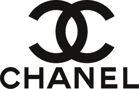 Chanel's intertwined C's and the clean, customized Chanel typeface that closely resembles Gotham bold are viewed as hallmarks of luxury elegance. Image credit: Chanel
The iconic Chanel logo is one of the best-known logos today. It is a lofty status symbol that the haves love to flaunt while the have-nots peer on with envy.
The logo was inspired by the decorative windows at the Chateau de Cremat in Nice. The logo is one of the earliest examples – and certainly the most famous – of “letterplay.”
Letterplay logos seek to arrange a business’s initials in visually creative ways to create a memorable and iconic original composition.
Unlike a traditional monogram, the letters are used purely as artistic elements. They can be flipped, rotated, overlapped or merged to create a finished product that can stand independently of the letters.
1950 – 1959
Frigidaire (1955)
![]() Frigidaire's logo brings back memories of the 1950s and the jet-set era. Image courtesy of Under Consideration. Copyright Frigidaire
Frigidaire's logo brings back memories of the 1950s and the jet-set era. Image courtesy of Under Consideration. Copyright Frigidaire
Frigidaire’s unique and memorable logo appeared in 1955. And, to this day, it acts as a visual time machine that can transport viewers back to that era.
This streamlined typeface logo implies speed, grace, and efficiency. And, it serves as a visual representation of the optimistic space-age zeitgeist of the 1950s.
Today, these retro script fonts are experiencing a resurgence in popularity – perhaps in response to the clean minimalism of the sans-serif fonts that dominate modern design.
1960 – 1969
IBM (1966)
![]() Paul Rand's logo for IBM is unmatched in the corporate world for its visual hammer. Image courtesy of IBM and PaulRand.design
Paul Rand's logo for IBM is unmatched in the corporate world for its visual hammer. Image courtesy of IBM and PaulRand.design
The IBM logo has changed many times over the years. But, in 1966, famed logo designer Paul Rand landed on the design that would become famous.
IBM’s iconic logo consists of bold block letters made up of 13 (1966) or 8 (1972) blue stripes.
IBM’s Web site explains that the horizontal stripes indicate “speed and dynamism.”
For the design world, those stripes opened up a whole new world of creative possibility in logo design.
![]() IBM's gets its stripes after several generations of logo evolution. Image credit: Quartz. Copyright IBM
IBM's gets its stripes after several generations of logo evolution. Image credit: Quartz. Copyright IBM
While initials will probably always be popular content for business logos, thanks to Paul Rand’s IBM logo, designers will continue to re-imagine boldly creative and meaningful ways to visually modify those letters to better communicate the brand they represent.
1970 – 1979
Nike (1971)
![]() Nike's distinctive logo is motion at its best, with a rightward, optimistic tilt. Image credit: Nike
Nike's distinctive logo is motion at its best, with a rightward, optimistic tilt. Image credit: Nike
Carolyn Davidson in 1971 originally designed the famous Nike “Swoosh” logo.
Only a student at the time, Ms. Davidson was paid a mere $35 for the design. But Nike founder Phil Knight never forgot her contribution. Ms. Davidson continued to work with Nike and was awarded shares of the company when it went public in 1983.
Ms. Davidson’s famous design was inspired by the brand’s namesake “Nike” – the Greek goddess of victory.
Nike was known for her wings, which allowed her to safely fly over battlefields. Ms. Davidson visually combined a check-mark with a wing to create a unique abstract shape that communicates speed and agility.
To this day, the Nike “Swoosh” is held up as an ideal example of an abstract logo that manages to perfectly communicate the brand’s identity.
Logo designers the world-over seek to create the next signature abstract logo design.
Apple (1977)
![]() This version of Apple's logo had a very 1970s-feel to it, but its DNA is still visible in the logo currently used by the company. Apple logo by Rob Janoff courtesy of Fine Print Art. Copyright Apple
This version of Apple's logo had a very 1970s-feel to it, but its DNA is still visible in the logo currently used by the company. Apple logo by Rob Janoff courtesy of Fine Print Art. Copyright Apple
The first Apple logo represents a very different brand than the Apple that we know today.
![]() Think late-19th century as inspiration for this Apple logo. Original Apple logo courtesy of Think Marketing Magazine. Copyright Apple
Think late-19th century as inspiration for this Apple logo. Original Apple logo courtesy of Think Marketing Magazine. Copyright Apple
Apple’s original logo – which featured Sir Isaac Newton about to be beaned on the head by an apple – resembled a print engraving. It looked old-fashioned, fussy and more like an antique shop logo than a technology logo. It was only used for a year.
Apple unveiled a new rainbow-striped logo in 1977 – just before the debut of the Apple II, which was the world’s first PC with a color display. The sleek, colorful design resonated with the public and the logo became an instant hit.
So what is the Apple logo’s legacy? It underlines the importance of choosing a logo that properly reflects your products and your brand.
A sleek minimalist logo was a perfect fit for a boundary-breaking technology company. But more than that, the logo visually reinforced the business’ brand name (Apple) and served as a reminder of the very thing that set Apple ahead of their competition at the time (color PCs).
1980 – 1999
World Wildlife Fund (1986)
![]() The WWF logo, in its reductive form, has done more for panda awareness than any icon for an animal worldwide. Image courtesy of dewebsite.org. Copyright WWF
The WWF logo, in its reductive form, has done more for panda awareness than any icon for an animal worldwide. Image courtesy of dewebsite.org. Copyright WWF
The World Wildlife Fund’s panda logo is a well-known and influential example of a negative space logo.
The panda featured in the WWF’s logo was inspired by Chi Chi – a giant panda living at the London Zoo in 1961 when the nonprofit was founded.
While the logo has remained very similar to the original, it has been updated over the years.
The most significant change occurred in 1986 when the panda transitioned from a traditional black-and-white line drawing to a more abstract panda defined by negative space.
The creative use of negative space helped to propel the logo into a more sophisticated and modern look. And it inspired other logo designers to follow suit.
FedEx (1994)
![]() The FedEx logo is absolutely, positively a right fit for the brand. Image credit: FedEx
The FedEx logo is absolutely, positively a right fit for the brand. Image credit: FedEx
Once you have seen the arrow in the FedEx logo, it is impossible to not see it.
If you do not know what I am talking about, look at the white space between the “E” and the “x” above.
FedEx transports packages, so an arrow suggesting movement is a perfect accompaniment to its brand name.
This incarnation of the Federal Express logo debuted in 1994. And this technique of creating layers of visual meaning has encouraged logo designers to be more creative in how they communicate in logos.
REMEMBER THAT if you choose to embrace any of the logo styles represented here for your own business, it is essential that you put your own unique, brand-specific spin on them.
It is never enough to cleverly replicate a logo style or create a brand identity based on a trend.
A logo – no matter how attractive – is a failure if it does not properly communicate the business it represents.
 Katie Lundin is a marketing and branding specialist at Chicago-based crowdspring
Katie Lundin is a marketing and branding specialist at Chicago-based crowdspring. Reach her at katie@crowdspring.com.
Share your thoughts. Click here